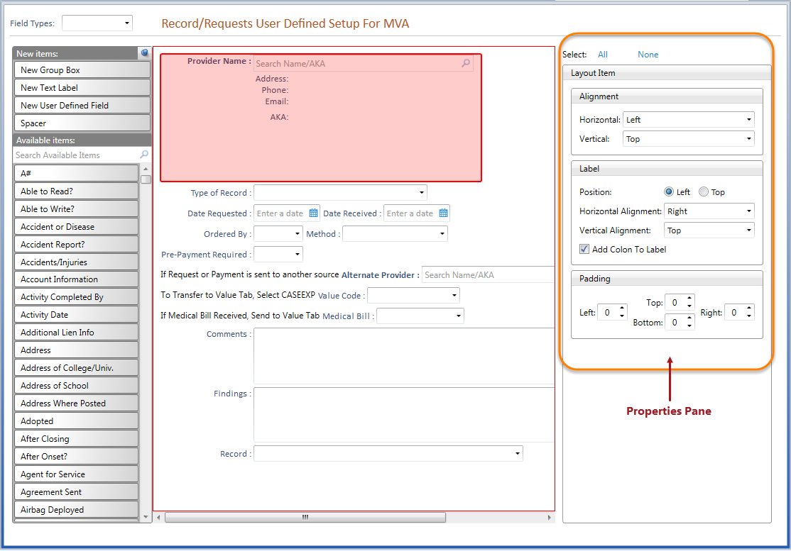
The Properties Pane, located on the right-hand side of the Screen Layout Designer Window, displays property settings specific to the type of item(s) currently selected on the Design Layout Screen. Use the Select All or Select None options at the top of the Properties Pane to easily select or deselect all items on the layout screen. Different Property Panes display depending upon the type of item(s) selected:
When a user defined field is selected on the Design Layout Screen, the Layout Item Properties Pane will display options for Alignment, Label and Padding.
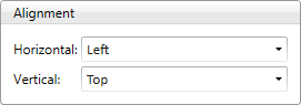
The Alignment group contains options for Horizontal alignment: Left, Center, Right or Stretch and Vertical alignment: Top, Center, Bottom or Stretch. The selected item will be aligned using the selected Horizontal and/or Vertical alignment.
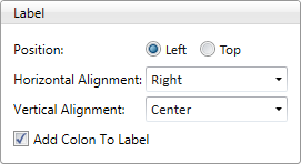
The Label group contains options for Position, Horizontal Alignment, Vertical Alignment and label colon. The label of a selected field can either be displayed to the left of the field or above a field. The label can be horizontally and/or vertically positioned in comparison to the field using the Alignment options. A colon can be added to or removed from the selected field label by clicking on the Add Colon To Label check box.
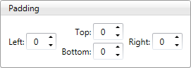
Padding is the desired amount of spaces that should be added to the Top, Bottom, Left and/or Right of the selected item.
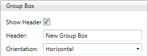
When a Group Box is selected in the Design Layout Screen, the Group Box Properties Pane will display options for Header and Orientation, Alignment, Item Space and Padding.
The header (title) of a new group box displays the text “New Group Box” by default and can be hidden by deselecting the Show Header check box. The header text can be changed by using the Header text field, and the Orientation of the header can be set to Horizontal or Vertical).
The Alignment group contains options for Horizontal alignment: Left, Center, Right or Stretch and Vertical alignment: Top, Center, Bottom or Stretch. The selected item will be aligned using the selected Horizontal and/or Vertical alignment.
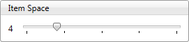
A group box may contain multiple items within it. The Item Space property use of a slide rule to increase or decrease the amount of the space between those fields. The slide rule is defaulted to 4 but can be changed to a max of 20.
Padding is the desired amount of spaces that should be added to the Top, Bottom, Left and/or Right of the selected item.
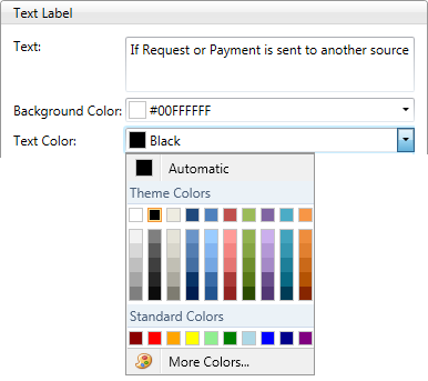
When a Text Label is selected on the Design Layout Screen, the Text Label Properties Pane will display options for modifying the text label and color, Alignment and Padding.
The “New Text Label” text can be modified in the Text field, as well as the Background Color and Text Color. Choose your desired color from the color palette using the Background Color and Text Color dropdowns.
The Alignment group contains options for Horizontal alignment: Left, Center, Right or Stretch and Vertical alignment: Top, Center, Bottom or Stretch. The selected item will be aligned using the selected Horizontal and/or Vertical alignment.
Padding is the desired amount of spaces that should be added to the Top, Bottom, Left and/or Right of the selected item.
When a spacer item is selected in the Design Layout Screen, the Layout Item Properties Pane will display options for Alignment modification.
The Alignment group contains options for Horizontal alignment: Left, Center, Right or Stretch and Vertical alignment: Top, Center, Bottom or Stretch. The selected item will be aligned using the selected Horizontal and/or Vertical alignment.
The General Properties Pane displays when multiple items on the Design Layout Screen are selected at the same time.
The Alignment group contains options for Horizontal alignment: Left, Center, Right or Stretch and Vertical alignment: Top, Center, Bottom or Stretch. The selected item will be aligned using the selected Horizontal and/or Vertical alignment.
All selected items will be aligned using the selected Horizontal and/or Vertical alignment.